


Large counters in 4.0 harder to read
Moderators: firepowerjohan, Happycat, rkr1958, Slitherine Core

Large counters in 4.0 harder to read
Hi all. I like to use the large counter format. In 4.0 the counters appear to be squished and the information numerals overlay the underlying terrain rather than the counter, making them much harder to read. Is this something that can be adjusted in the next release?
-
Peter Stauffenberg
- General - Carrier

- Posts: 4745
- Joined: Sun Jul 08, 2007 4:13 pm
- Location: Oslo, Norway
Re: Large counters in 4.0 harder to read
This is done on purpose because the older large Counters covered the entire terrain below. Now you can actually see enough of the terrain below so you can actually know what you're attacking. Before you had to turn units off to see the river, terrain type and resource.
-
OxfordGuy3
- Staff Sergeant - Kavallerie

- Posts: 336
- Joined: Fri Jan 04, 2008 10:32 pm
- Location: Oxford, UK
Re: Large counters in 4.0 harder to read
I actually prefered the older large counters too, even though they did obscure the underyling terrainStauffenberg wrote:This is done on purpose because the older large Counters covered the entire terrain below. Now you can actually see enough of the terrain below so you can actually know what you're attacking. Before you had to turn units off to see the river, terrain type and resource.
-
Peter Stauffenberg
- General - Carrier
- Posts: 4745
- Joined: Sun Jul 08, 2007 4:13 pm
- Location: Oslo, Norway
Re: Large counters in 4.0 harder to read
I liked the large counters too, but ended up not using them since it was hard planning any offensives. So I used the small counters instead. Now I use the new large counters and after some time to get used to I prefer them too since they don't interfere with my planning.
Vokt is the master of the large counters and he's the one who can change these. So if you tell your preferences then maybe he will listen.
Vokt is the master of the large counters and he's the one who can change these. So if you tell your preferences then maybe he will listen.

Re: Large counters in 4.0 harder to read
I don't know how values in new large counters values could be harder to read when the font sizes are the same as in older ones.
Maybe old counters were "nicer" but they definitely had less functionality than new ones since they covered the entire hex. IMO, in a wargame which is about planning and strategy, it should be given priority to functionality over other considerations.
Just for comparison I attached 2 shots of the same scenario (Battle for France) from my AAR's, using both types of counters:
Old large counters:
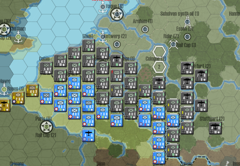
New large counters:

It's plain to see from the shots comparison that new counters allow for a general cleaner view of the whole scenario. New counters allow for seeing rivers, fortresses, resources, cities, capitals, etc all of which were covered with old large counters. As a sample, see how that forest hex 2xSE of Lille is possible to be identified as a forest hex with new counters but it was very hard to distinguish as that in old counters.
Stauffenberg is right that when you get used to the new large counters with all the functionality and info they provide, you don't want others. I have to admit that I missed old counters at first, but I soon discarded them.
So only thing that occurs to me to change in order to further improve the counters is to change the font size of the strength of the unit number. Since combat values are always in white colour, there's no problem in distinguishing them but strength number colour changes with efficiency level. Maybe a larger strength number won't hurt.
Maybe old counters were "nicer" but they definitely had less functionality than new ones since they covered the entire hex. IMO, in a wargame which is about planning and strategy, it should be given priority to functionality over other considerations.
Just for comparison I attached 2 shots of the same scenario (Battle for France) from my AAR's, using both types of counters:
Old large counters:
New large counters:
It's plain to see from the shots comparison that new counters allow for a general cleaner view of the whole scenario. New counters allow for seeing rivers, fortresses, resources, cities, capitals, etc all of which were covered with old large counters. As a sample, see how that forest hex 2xSE of Lille is possible to be identified as a forest hex with new counters but it was very hard to distinguish as that in old counters.
Stauffenberg is right that when you get used to the new large counters with all the functionality and info they provide, you don't want others. I have to admit that I missed old counters at first, but I soon discarded them.
So only thing that occurs to me to change in order to further improve the counters is to change the font size of the strength of the unit number. Since combat values are always in white colour, there's no problem in distinguishing them but strength number colour changes with efficiency level. Maybe a larger strength number won't hurt.
-
captkiwi
- Administrative Corporal - SdKfz 251/1

- Posts: 133
- Joined: Sun Apr 26, 2009 3:05 am
- Location: New Zealand
Re: Large counters in 4.0 harder to read
I prefer using icons...no issues with seeing the terrain...
Re: Large counters in 4.0 harder to read
Thanks for explaining all the thought that went into it. It is nice to know you both missed them also. I will give the new large counters a chance. Since strength changes with efficiency level, I agree that a larger strength number may be helpful.